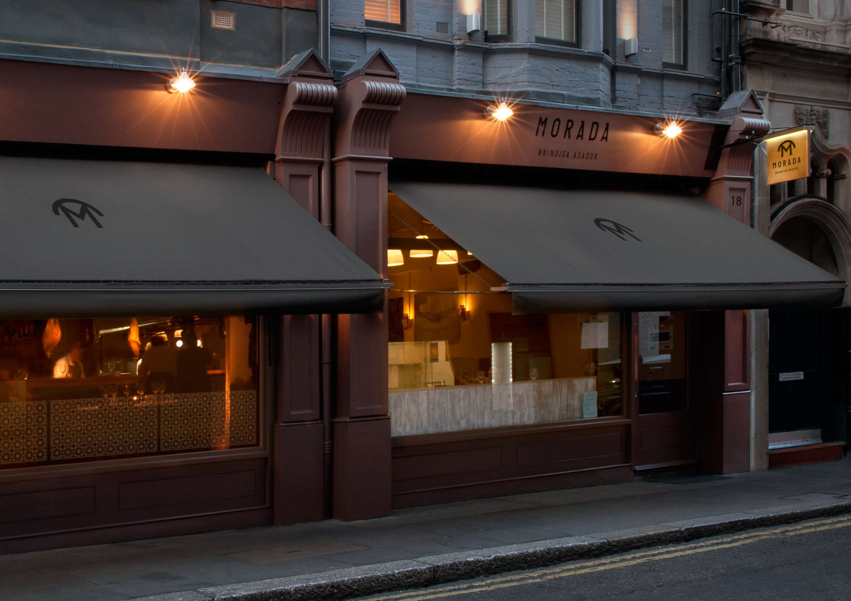
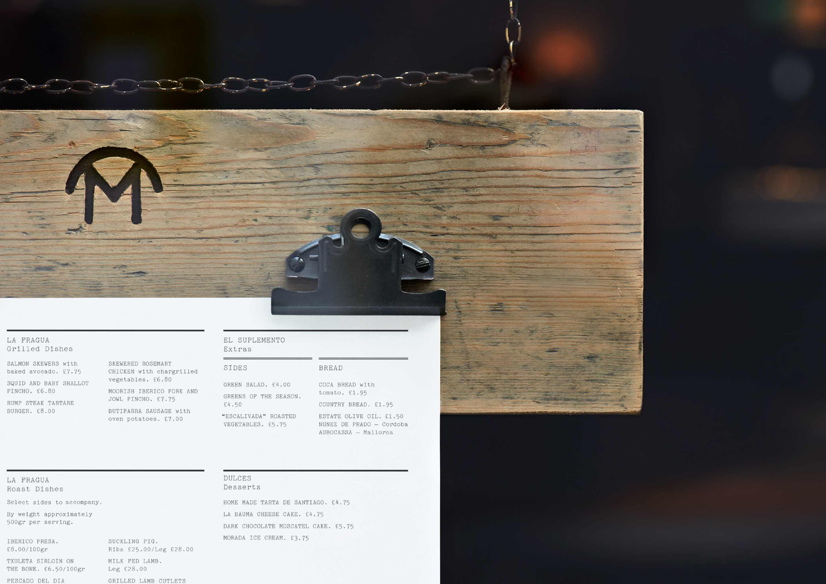
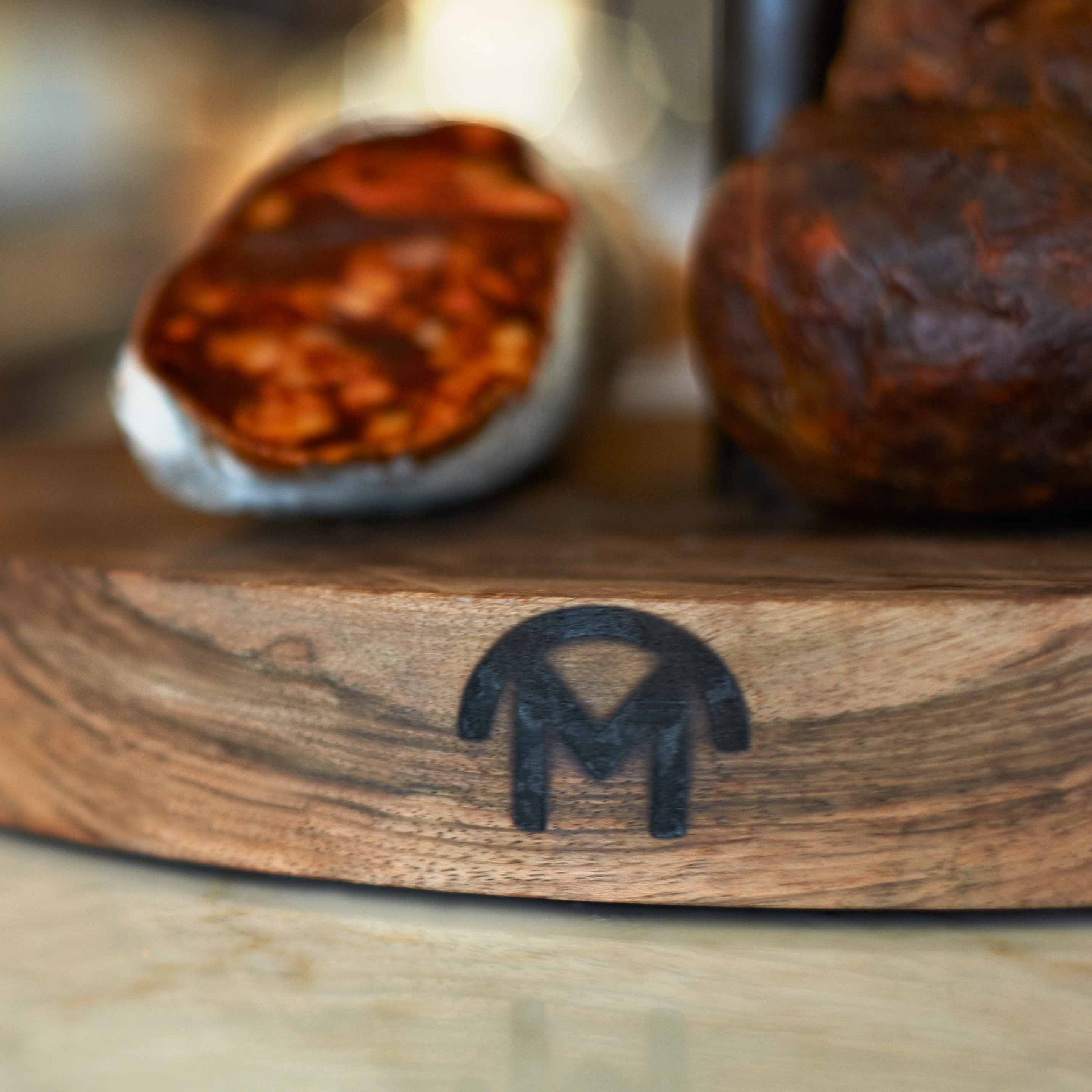
WE PARTNERED ON
Visual identity, print design, photography.

Brief

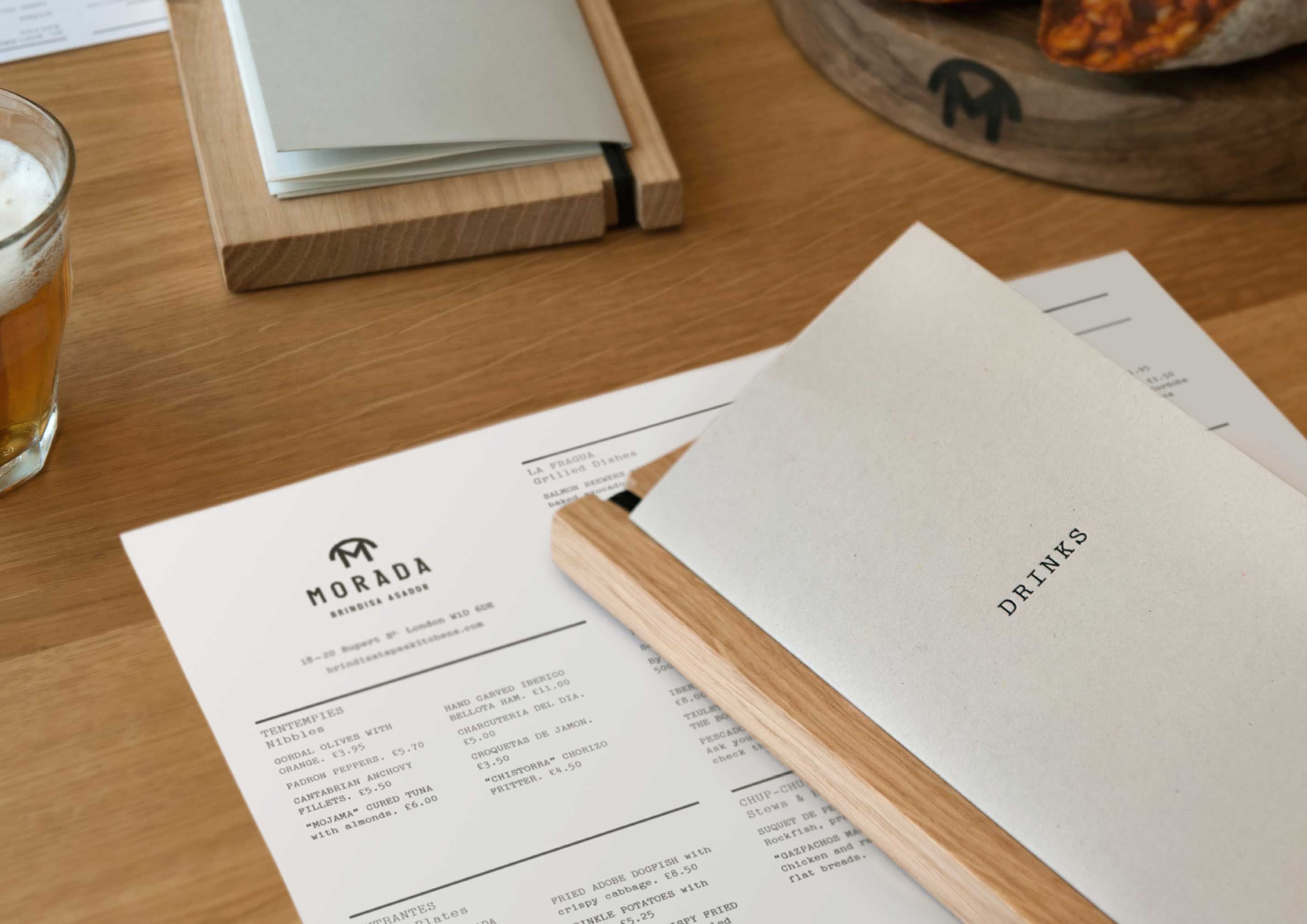
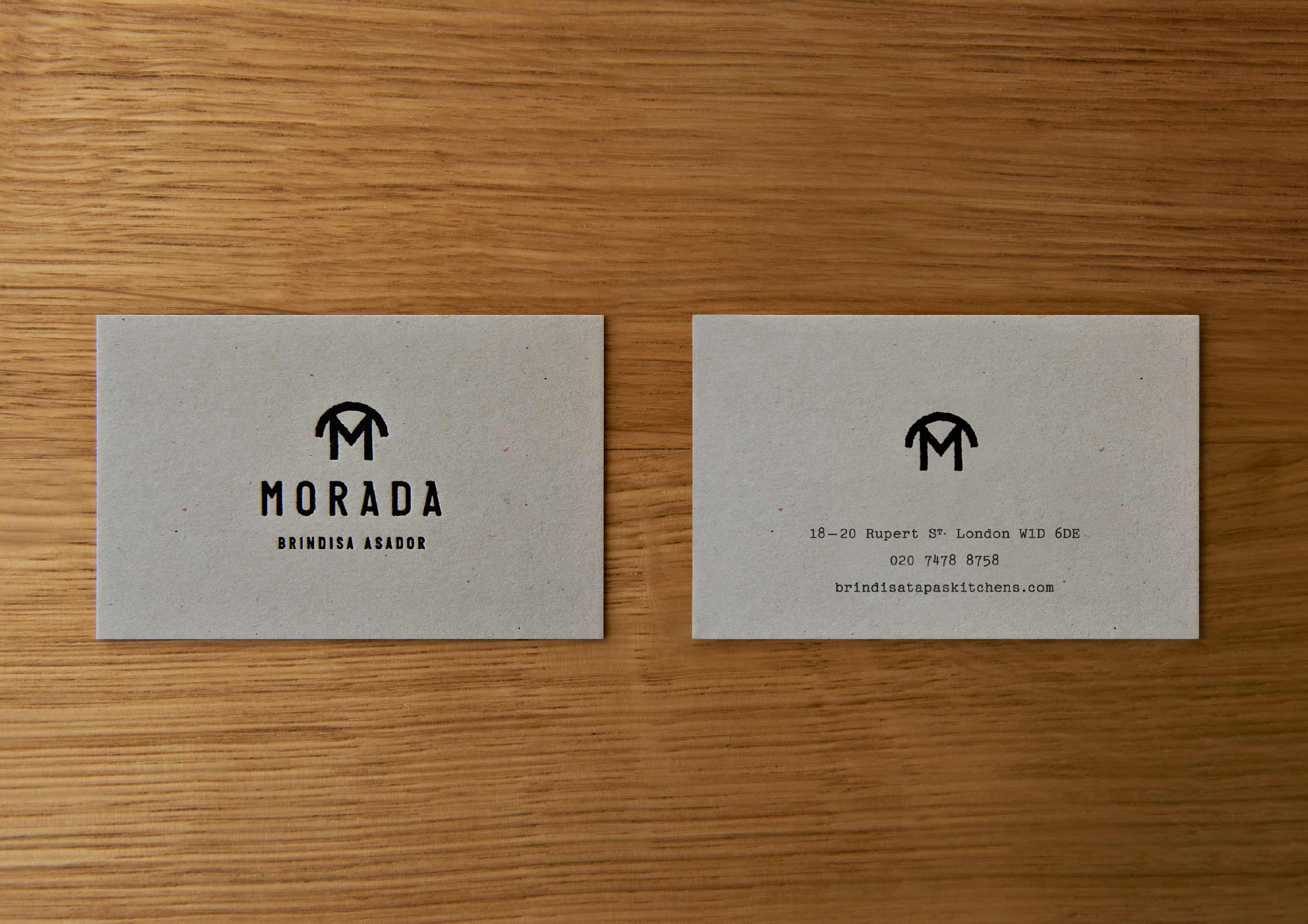
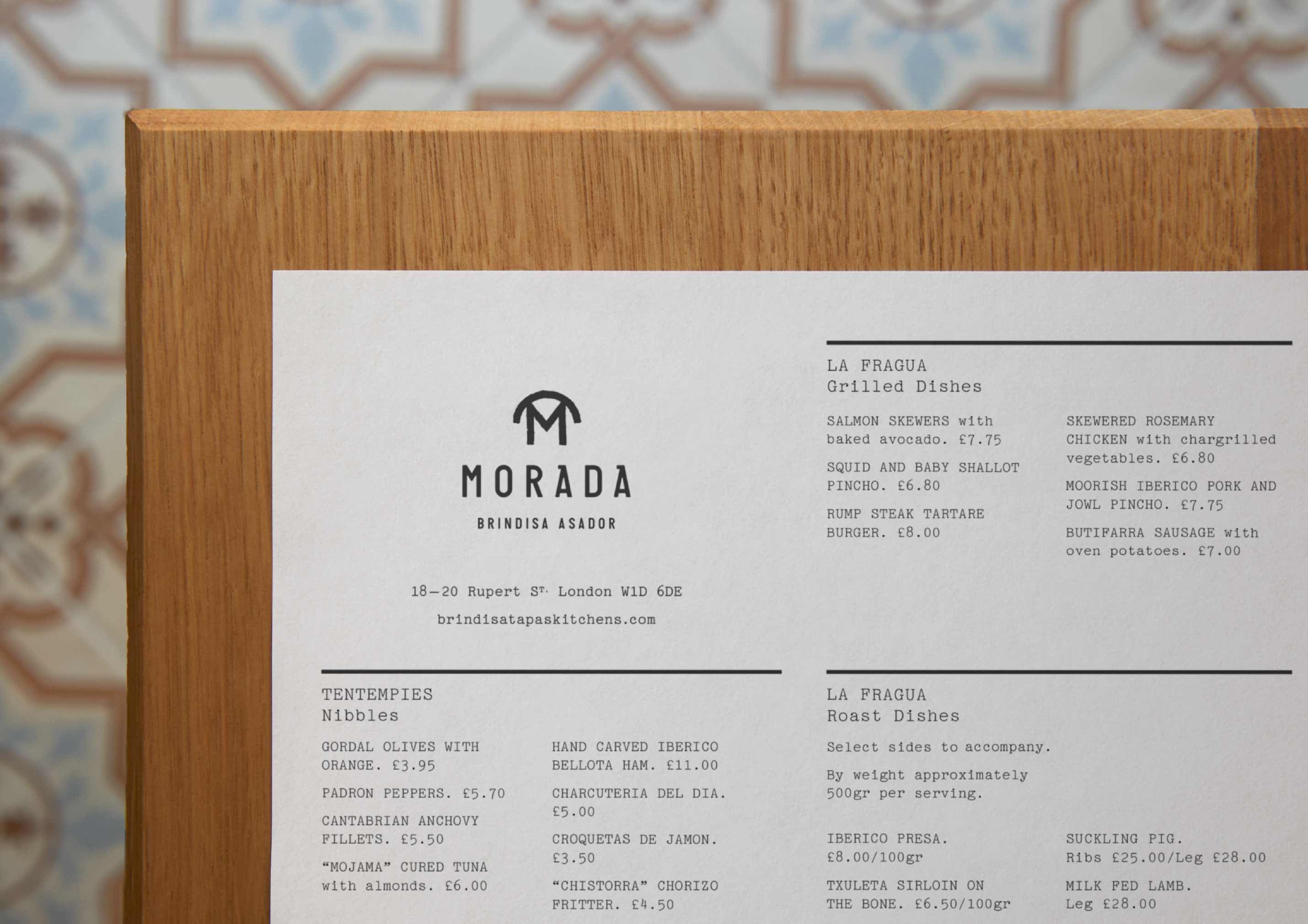
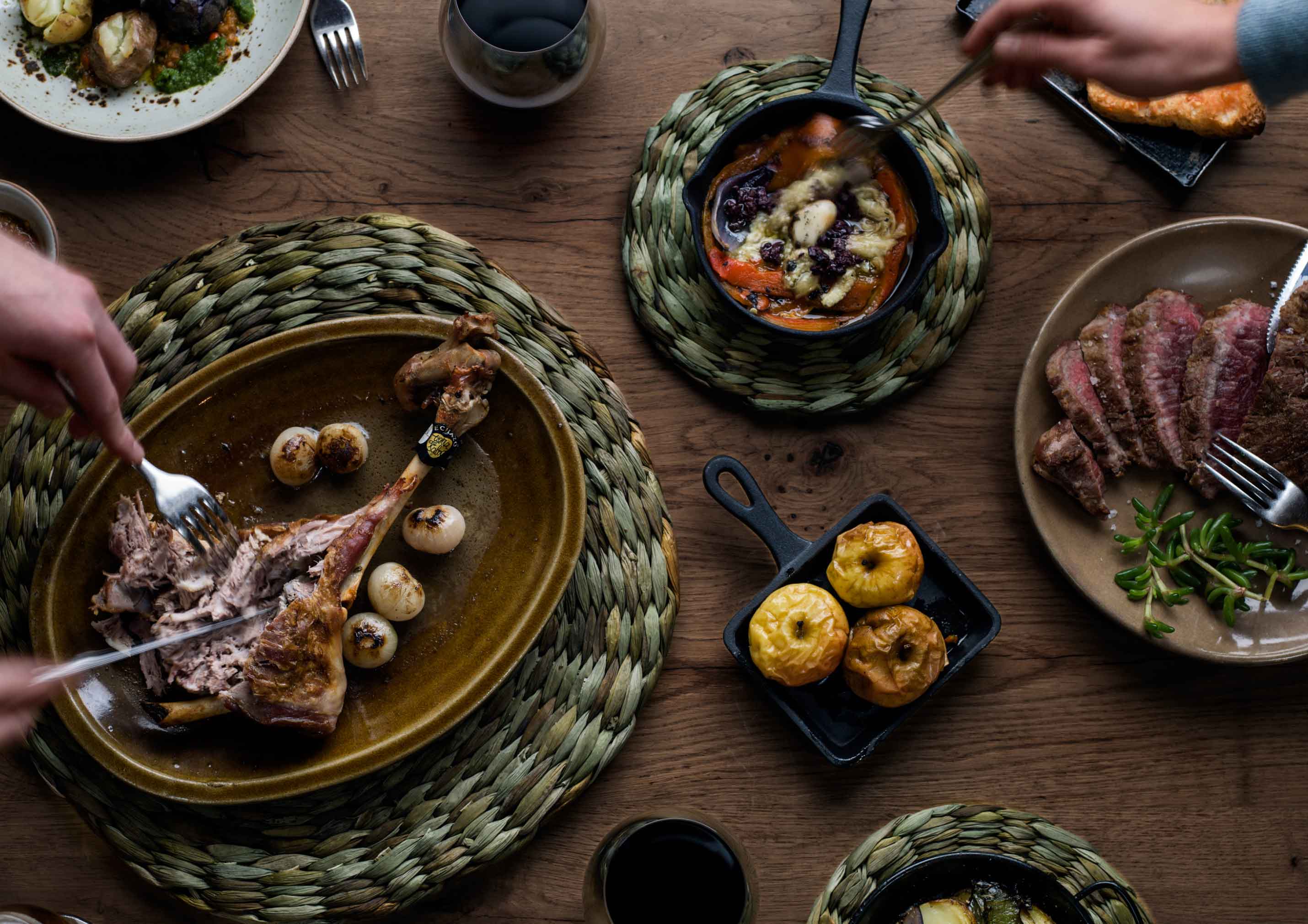
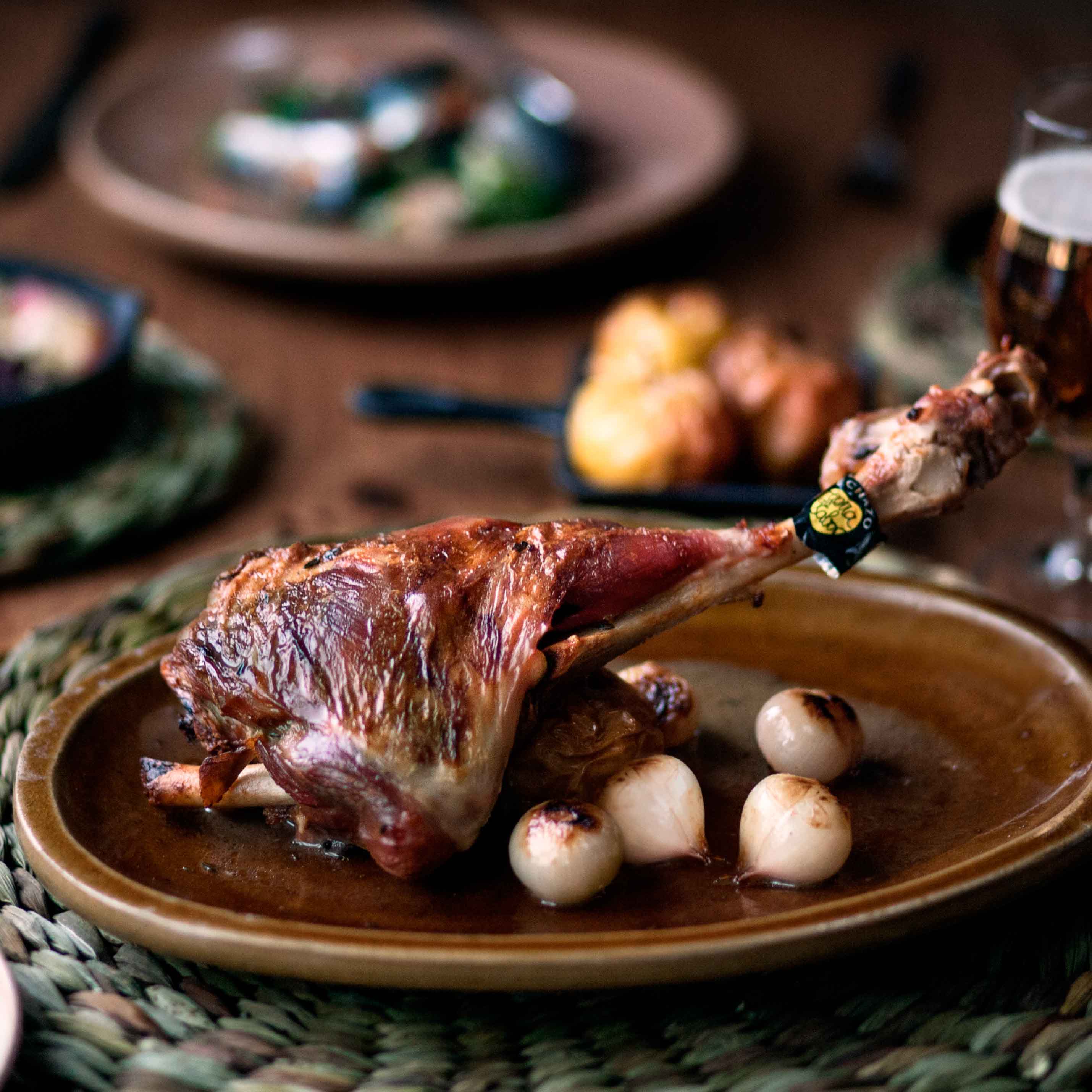
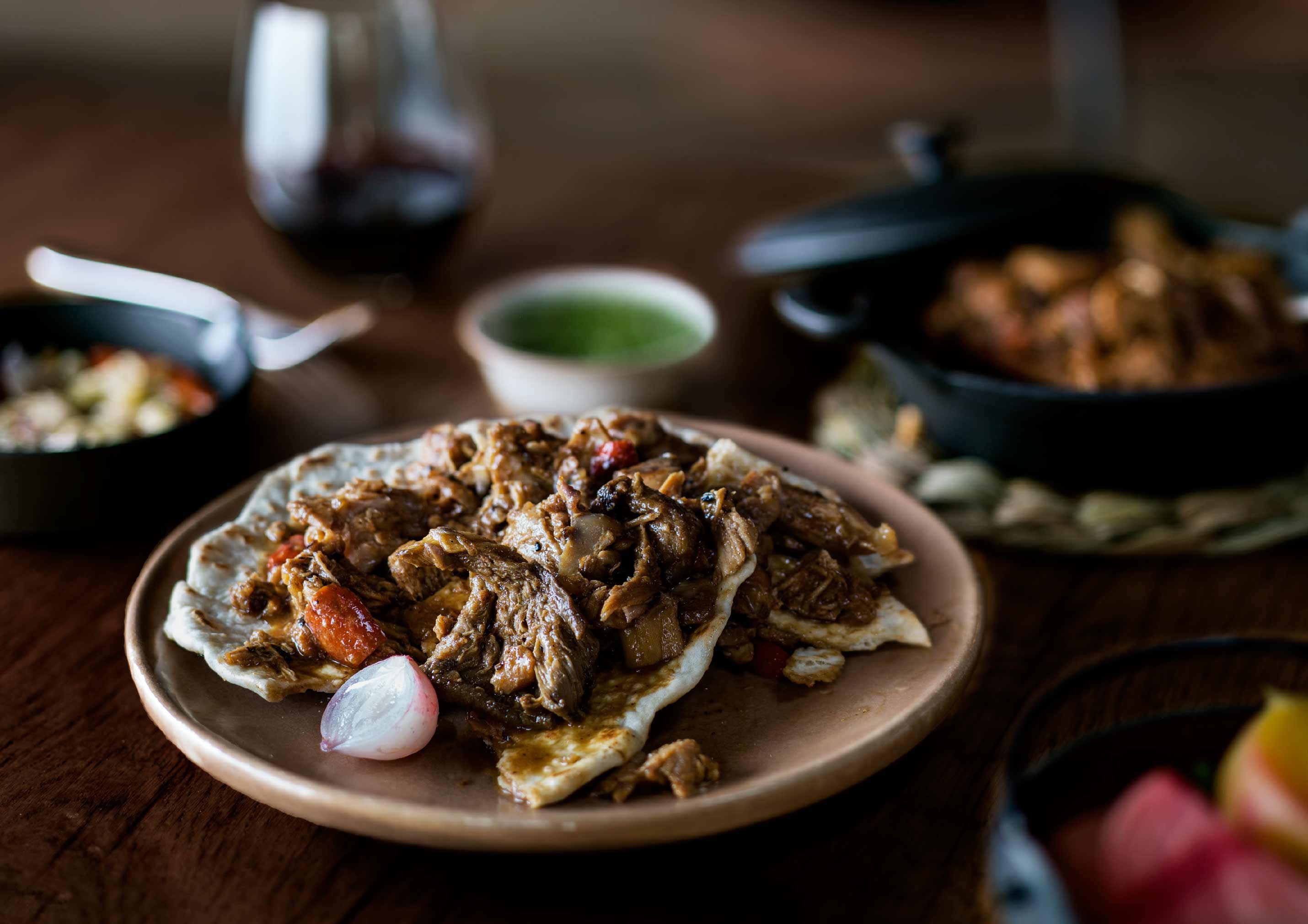
The menu for Morada Brindisa Asador focusses on the Castilian tradition of roasting suckling pigs and lamb in an ‘asador’, a vast wood fired oven. Our job was to bring this to life through a visual identity, then apply it across a range of touch-points.

Visual identity

We created an identity system that brings this to life by referencing livestock branding irons. The letterform of the ‘M’ device is taken directly from a traditional cattle branding iron alphabet, with the arc – or roof – above the letters neatly communicating the origins of the name: a Castilian term for home or dwelling.

Photography & art direction

We commissioned and art directed a suite of imagery that could be used across all of Morada’s launch materials, from PR to digital.

See more work